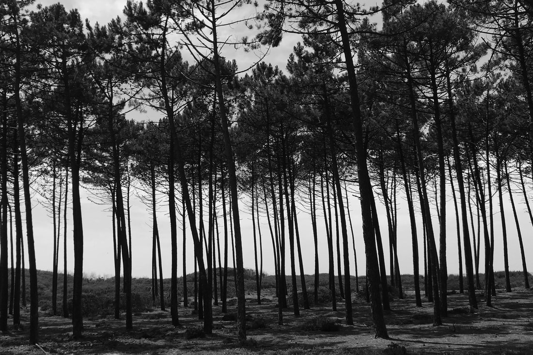
Line and Shape.
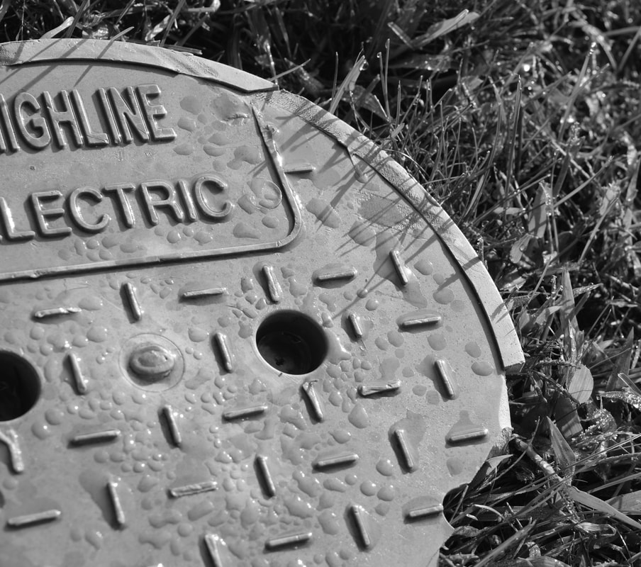
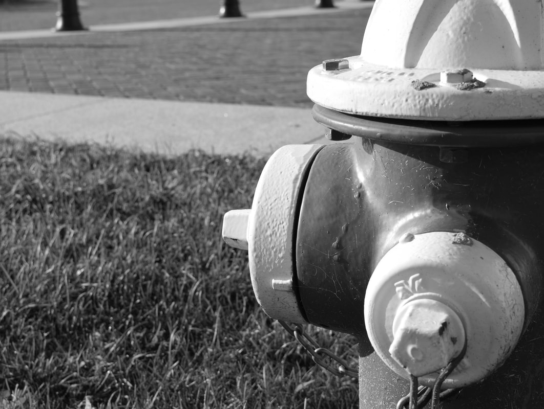
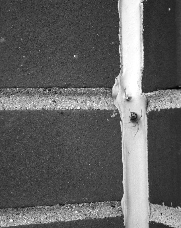
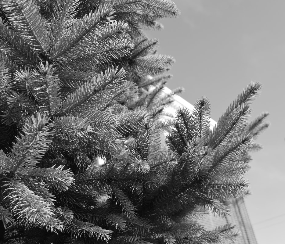
I shot these photos straight on, and close up. The close up perspective allows the shape of the subject to develop and be more defined. Shooting the photos straight on created more lines. I also used the law of thirds to make the images pop and make the viewer give a second look. For example, the spider on the bricks photo is not centered. this follows the law of thirds and makes the image more interesting. All of the photos are also net centered in order to comply with the law of thirds.
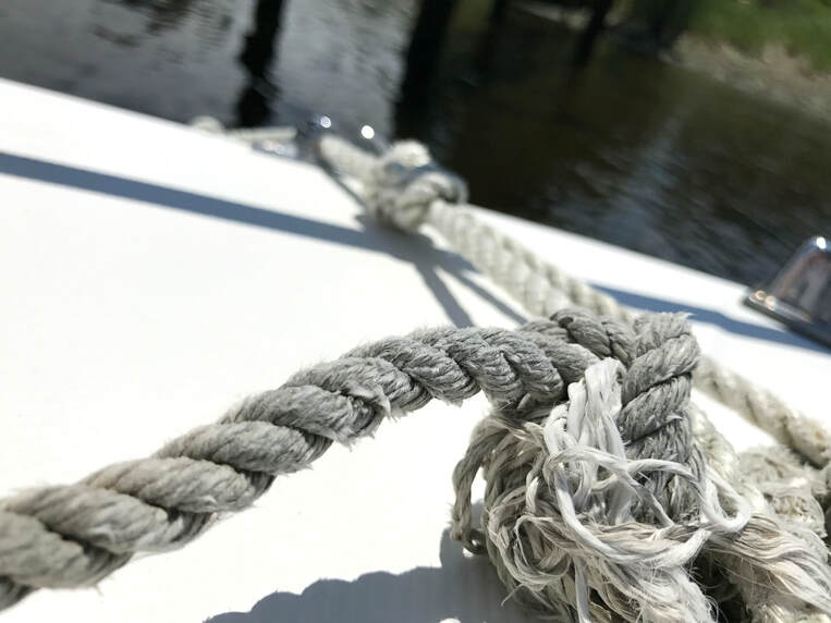
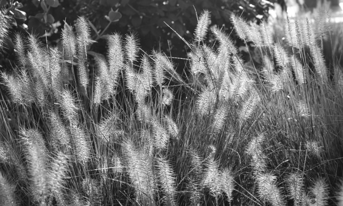
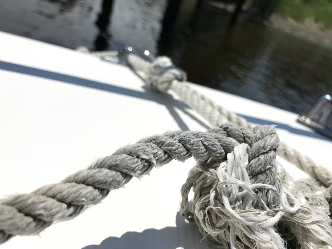
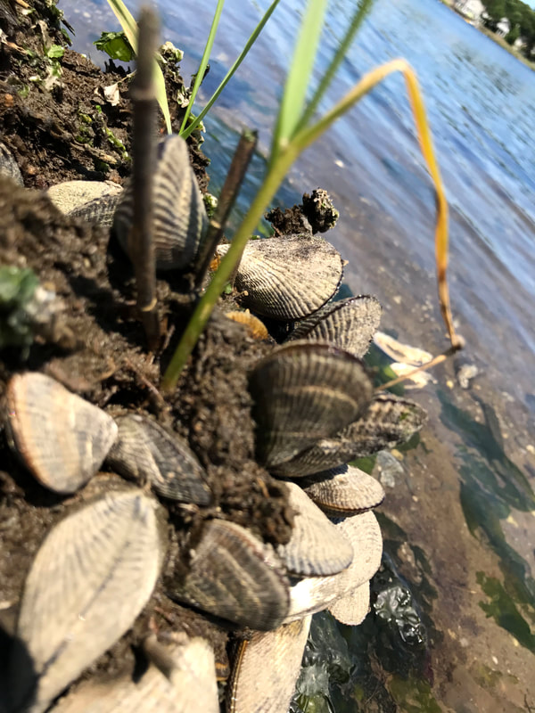
Pattern and Texture.
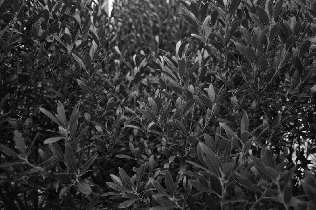

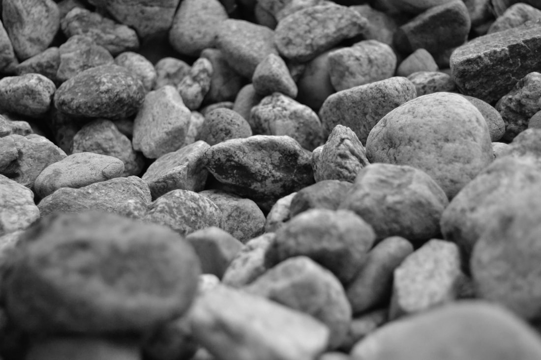
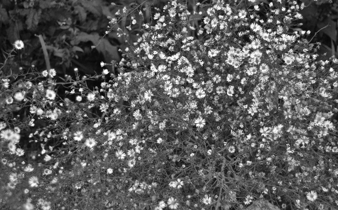
I focused on the surface quality of these images by creating focus on particular objects in the images. For example, I honed in on some of the rocks in the third photo, focusing on the surface quality and texture of the rocks. The photo I feel is the most well shot is the second photo of the pinecone. The focus on the surface of the pinecone and the texture shown is really nice. The lighting was also Important because it helped captivate the surface off the objects creating there texture better. If theres one photo I would shoot again it would be the sixth photo of the flowers. I'd zoom in on them more in order to create more emphasis on the texture of the flowers.
Powerlines and Playgrounds.
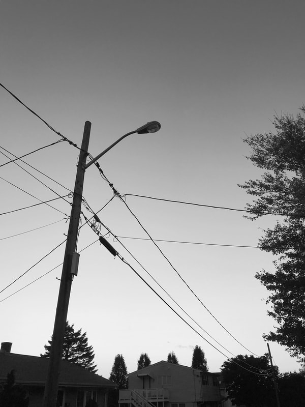
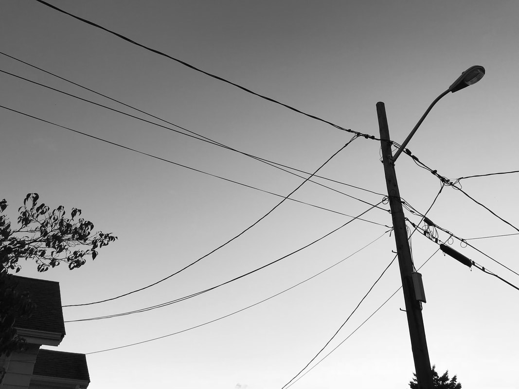
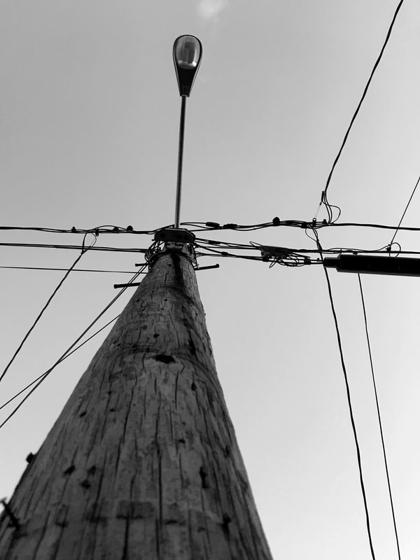
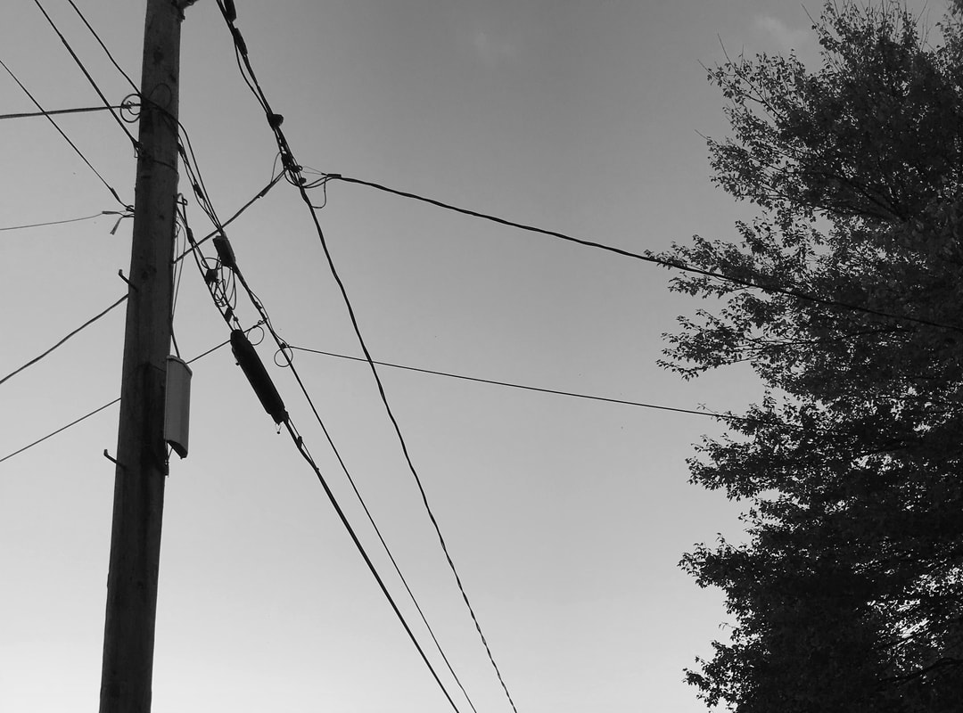
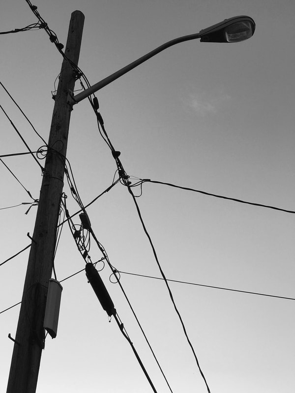
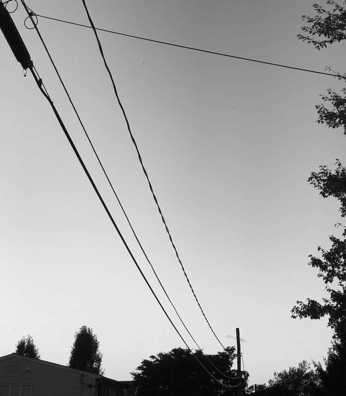
The rule of thirds was greatly considered in my shots because I wanted the viewer's eye to move throughout the photo. To accomplish this, I spread the power lines throughout the different photos, none in the middle. I believe the photo on the top right has a dynamic composition. The viewpoint allows the viewer to move completely throughout the image and view power lines from a different perspective. The bottom left photo uses the most organic shapes due to the pole and the tree creating interesting shapes in the photo. The power lines provide line in the photo that makes it stand out. The photo on the top right best represents this assignment due to the perspective in which its shot and the display of shapes in power lines. It makes the viewer look throughout the photo and take a long look at it.
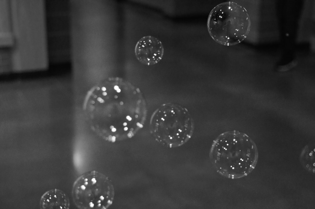
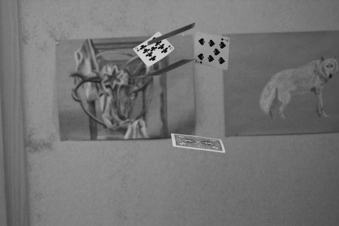
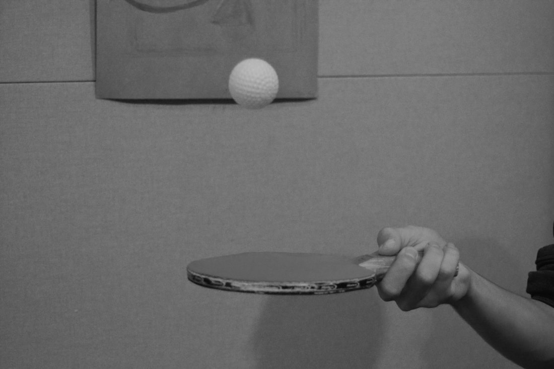
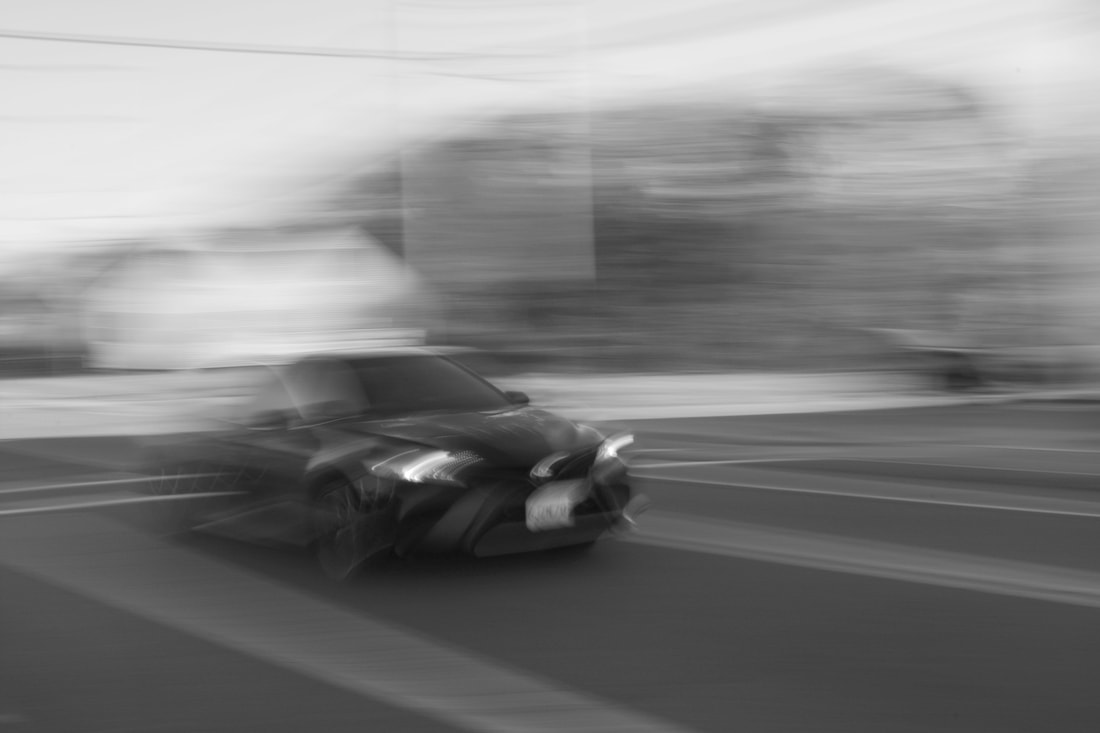
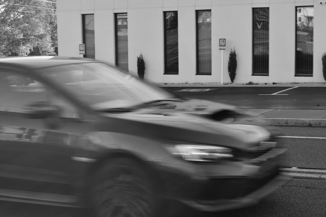
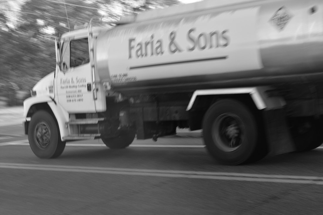
Motion.
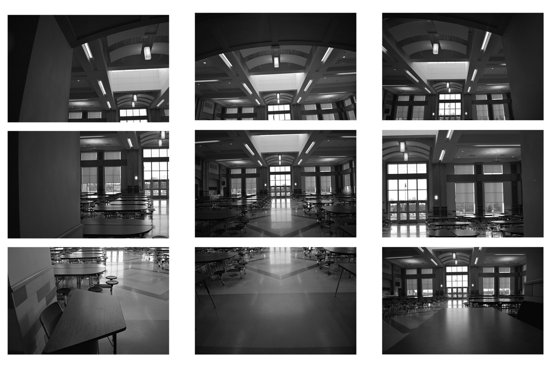
Hockney Grid Photo.
TERM 2
Depth of Field


TERM 3
Portraits

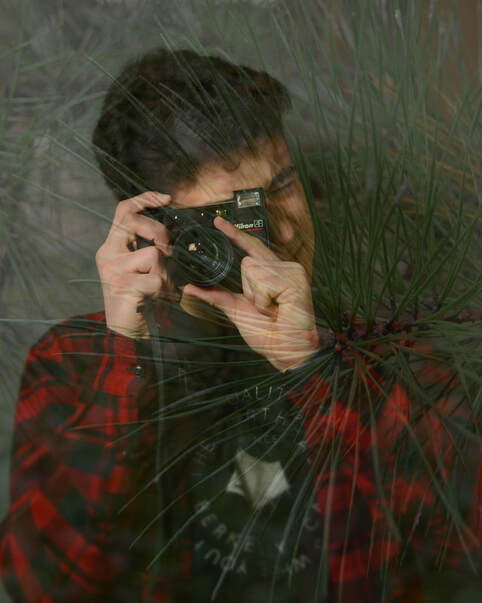
Double Exposure photo
Favorite Person, Place, Thing

-Greatest Hits-
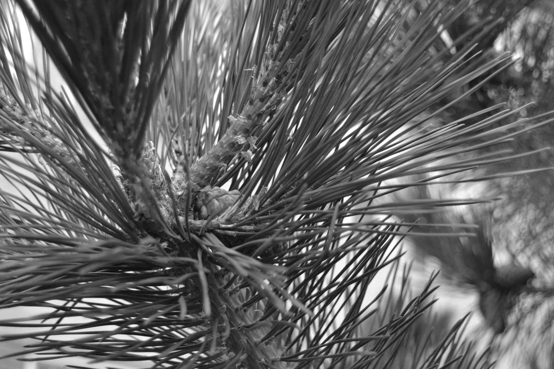
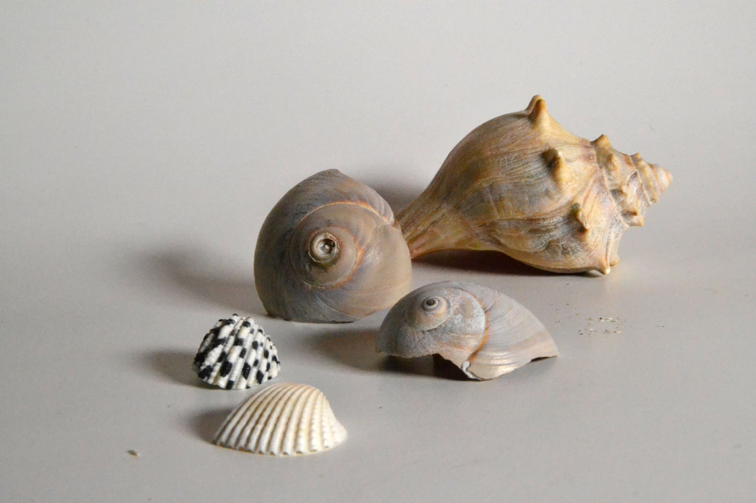
What compositional elements and principles are present in your photo?
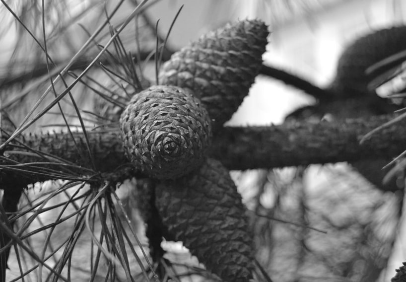
In this photo, I used many compositional elements. Some of these elements include: Law of thirds, texture, and lines. Law of thirds is present because I ddi not center the photo, I put the main pinecone to the left a bit to make the photo more interesting. I captured the texture of the pinecone as well, creating an interesting element in order to capture the viewer's attention. I used the pines and the branch as lines in the photo, giving it a better overall structure and composition. Those are the compositional elements I feel are most prevalent in this photo.
Technically, how did you control the camera, lighting, or your position when you took the photo to create a successful shot?
For this photo, I had to get very close to my subject. In order to achieve this point of view, I went straight up to the pine cone and shot it straight on, creating that perspective. I also made sure to focus the camera on the tip of the pinecone, making the focus mostly on there center of the pinecone.
Artistically, were you able to create a photo with a sense of mood or special meaning? (or) Were you able to show an interesting point of view? (or) Does the subject hold the viewer’s attention?
In this photo, I mostly looked to show an interesting point of view on a. seemingly normal subject. I wanted to make the viewer see a new perspective on an ordinary plant. the interesting viewpoint was slo used to hold the viewer's attention and make them think twice about he photo they are seeing.
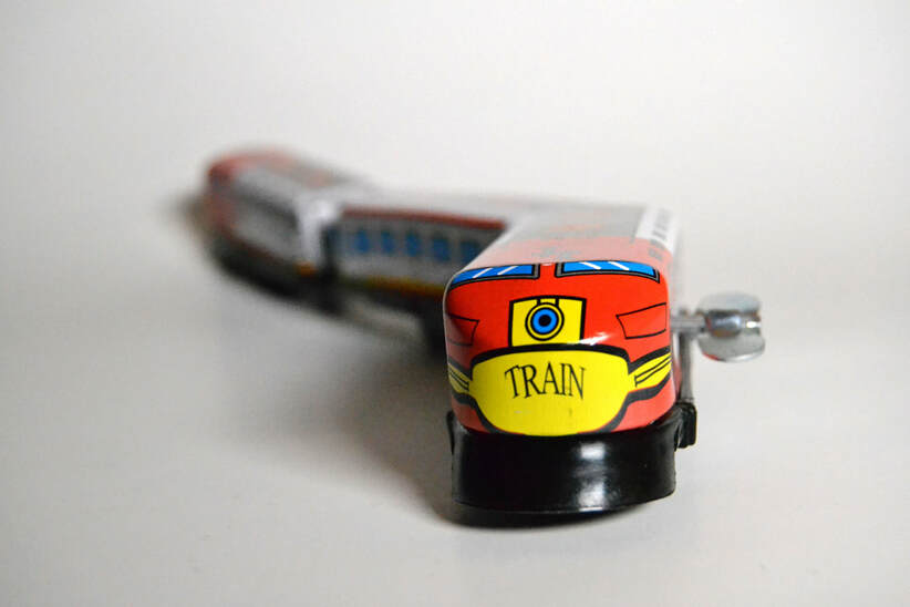
What compositional elements and principles are present in your photo?
For this photo, I was bale to utilize the law of thirds, depth of field, and line. As for there law of thirds, the subject (the train) is off center and is on the right side of the photo, capturing the viewer's attention. I also used a very narrow depth of field, only capturing the front of the train. This creates a really cool effect on the photo by blurring out all the tother train are besides the first one. I also utilized the lines the train makes by tis shape, and tried to incorporate that into my photo.
Technically, how did you control the camera, lighting, or your position when you took the photo to create a successful shot?
For the lighting in this photo, I used studio lighting and used white construction paper as there background to create more focus on the color of the train. I also got close to the train and shot a straight on perspective of the train to achieve that point of view of the train coming at the camera. As for the depth of field, I focused the camera strictly on the car, and created a very narrow depth of field.
Artistically, were you able to create a photo with a sense of mood or special meaning? (or) Were you able to show an interesting point of view? (or) Does the subject hold the viewer’s attention?
In this photo, I looked to capture the viewer's attention and show an interesting point of view. By achieving that certain depth of field, I believe that was able to capture the viewer's attention and overall create a successful shot.
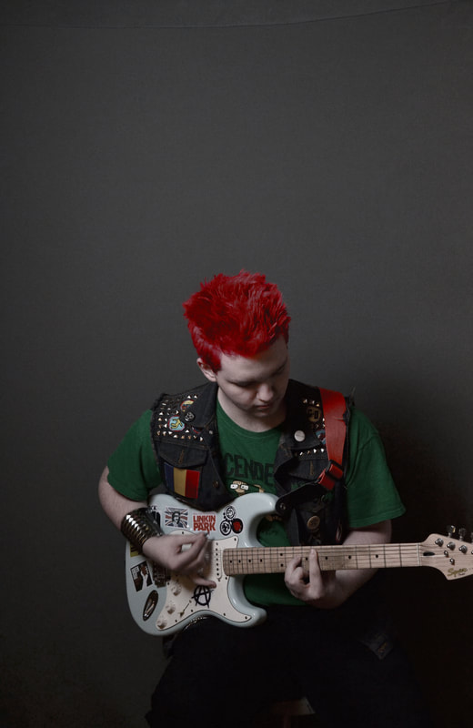
What compositional elements and principles are present in your photo?
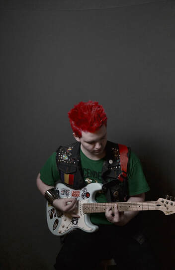
Some off the compositional elements I used in this photo were shape, color, law of thirds, shadows, and many others. As for shape, I focused on the shape of my subject and built the photo around him. For the color of this photo, I edited the photo to where the color of his hair would pop and create a really cool element to the photo. As for Law of Thirds, I looked to have my subject slightly off center to make it more interesting. I looked to capture his shadow and create a more interesting composition.
Technically, how did you control the camera, lighting, or your position whenyou took the photo to create a successful shot?
I controlled the lighting by having ht studio light on the ride side of the studio, creating the shadow on my subjects left side. I focused the camera in on my sub edict and used a tripod to keep the camera steady when shooting. I placed the camera a few meters back from ym subject being able to capture him fully in the photo.
(How did you consider distance, point or view and camera angle?)
Artistically, were you able to create a photo with a sense of mood or special meaning? (or) Were you able to show an interesting point of view? (or) Does the subject hold the viewer’s attention?
in this photo I looked to capture the viewer's attention as well as portray my subjects personality. I feel as if this photo speaks to the viewer by displaying many characteristics of the subject and splaying a cool interest of being a musician. Overall I feel this photo was shot mostly to portray the subject and hold the viewers attention due to how interesting the photo is as a whole.